Marketing Sections
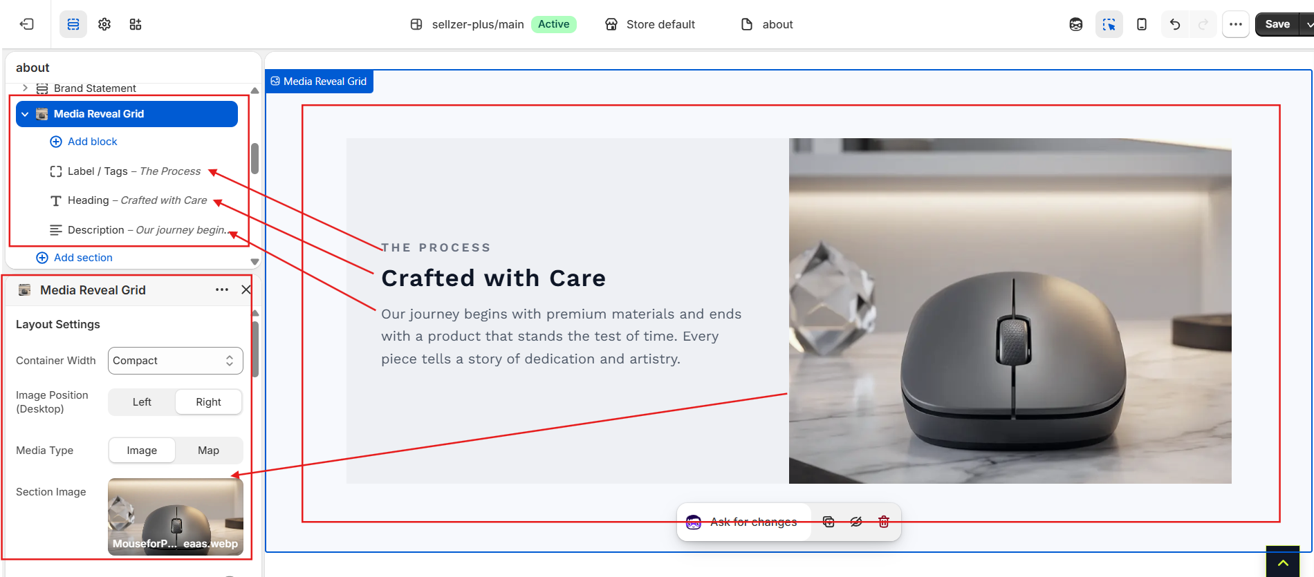
Media Reveal Grid
A premium split layout presenting an elegant balance between high-quality media (images or maps) and editorial content areas.
Media Reveal Grid Layout (Desktop)
Media Options
Image Media
Showcase a high-resolution image with a slow, smooth zoom effect on hover. Perfect for lookbooks or highlighting product aesthetics.
Map Integration
Seamlessly embed a Google Map by providing an address or a custom iframe code. Ideal for displaying store locations alongside brand text.
Content Composition
The content side of the grid is built using modular blocks, allowing you to structure the message flexibly:
- Labels/Tags: Small, uppercase tracking text for categorization.
- Heading: A prominent title with responsive sizing controls.
- Description: A rich text area for compelling storytelling.
- Date: Useful for blog teasers or event announcements.
- Action Button: A sleek, circular arrow button for navigation.
Responsive Layout Control
You can explicitly set the position of the media (Left or Right) on desktop viewports. The section also allows you to configure exact section heights independently for both mobile and desktop screens to ensure perfect proportions.