Brand Statement Section
An editorial-grade, typography-centric section for displaying key slogans, founder quotes, and brand narratives. Complete with interactive inline image badges and custom underline squiggles.
Section Overview
The **Brand Statement** section (`sections/brand-statement.liquid`) allows you to showcase high-impact typography blocks anywhere on your homepage or landing pages. Instead of basic text boxes, it gives store builders granular control over layout widths, alignment, responsive typography sizes, and independent light/dark mode color palettes.
Section-Level Layout Settings
When you click on the main **Brand Statement** header inside the Shopify Theme Editor, you can customize the general outer container settings that govern all blocks within the section:
Container & Widths
Adapt the horizontal bounding box to align perfectly with adjacent sections:
- Default (Page Width): Centers the section within the global theme margins.
- 1360px: Wide containment mode, ideal for spacious layouts.
- 1280px: Narrower containment, focusing user attention inward.
Typography & Spacing
Global controls to adjust text layout and padding margins:
- Text Alignment: Align all blocks in the section to the Left, Center, or Right.
- Padding (Top/Bottom): Scale spacing inside the background frame (0px to 160px).
- Margin (Top/Bottom): Adjust outer spacing between sections (0px to 100px).
| Setting Label | Theme Setting ID | Input Type | Default Value |
|---|---|---|---|
| Container Width | container_width | Select Dropdown | page-width |
| Text Alignment | text_alignment | Select Dropdown | center |
| Background Color | background_color | Color Picker | #f4f4f4 |
| Background Opacity | background_opacity | Slider (0% - 100%) | 100% |
Supported Section Blocks
The **Brand Statement** section supports a modular block architecture. You can add, remove, and reorder any of the following blocks inside the Shopify Theme Editor sidebar:
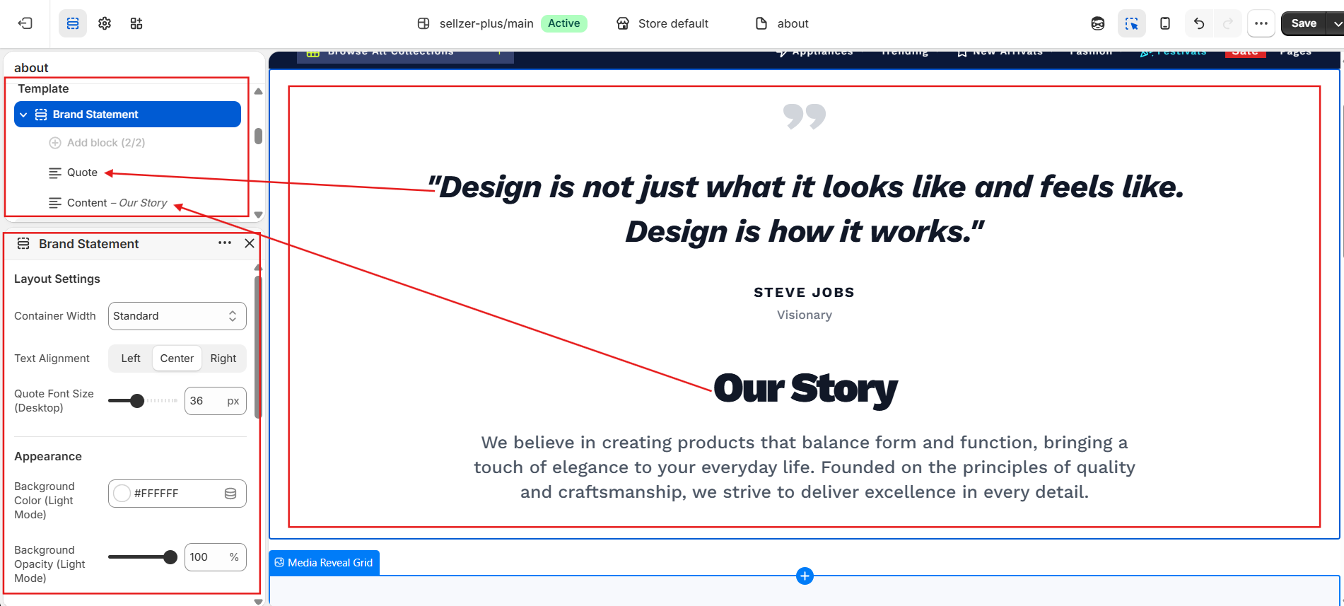
1. Quote Block
Limit: 1 per sectionDesigned for editorial reviews, industry accolades, or founder statements. Features a stylized double-quote icon wrapper at the top of the block.
Block Parameters
- Show Quote Icon: Toggle block-level SVG quote graphic.
- Enable Italics: Applies italic formatting and a custom 2-degree visual skew.
- Quote Statement: Large text area input for block text content.
- Author Name: Renders author identity in bold, tracked uppercase typography.
- Author Title: Renders subtext label (e.g. "CEO, Brand Name").
Typography & Style Options
- Desktop Font Size: Range slider (16px to 80px, Default: 36px).
- Mobile Font Size: Range slider (12px to 50px, Default: 24px).
- Font Weight: Select list (300 - Light to 900 - Black, Default: 800).
- Dual Color Controls: Custom picker inputs for both light and dark backgrounds (Text, Author Name, Author Title, Quote Icon).
2. Content Block
Limit: 1 per sectionProvides a structured combination of a large bold heading and a rich-text paragraph block. Ideal for introducing brand pillars, missions, or brief brand descriptions.
Block Parameters
- Heading Text: Main headline field.
- Description: Standard Shopify Rich Text editor (supports links, bold, lists).
- Heading Font Sizes: Desktop (18px - 90px, Default: 48px), Mobile (14px - 60px, Default: 32px).
- Heading Weight: Options from 300 to 900 (Default: 900).
Description & Color Parameters
- Description Font Sizes: Desktop (12px - 40px, Default: 20px), Mobile (10px - 30px, Default: 16px).
- Description Weight: Options from 300 to 700 (Default: 500).
- Independent Colors: Configure custom colors for both the Heading and Description across Light and Dark Modes.
3. Highlight Statements
No block limitsIncludes three specialized statement blocks: Innovative Statement,Sustainable Statement, and Best Deal Statement. These templates are pre-configured with themed accent colors and are fully optimized for the bracket highlight squiggle underline syntax.
Block Parameters
- Statement Text: Plaintext input area supporting bracket markup.
- Show Squiggle: Toggle visibility of the SVG hand-drawn underline under highlighted terms.
- Typography Options: Desktop (18px - 100px, Default: 48px), Mobile (14px - 60px, Default: 28px), Weight (Default: 800).
Color Config Variables
- Base Text Color: Main body text color picker (Light/Dark).
- Highlight Accent Text Color: Colors for highlighted bracketed terms (Light/Dark).
- Highlight Squiggle Color: Color pickers for the underline SVG (Light/Dark).
4. Badge Statement Block
No block limitsOur premium design statement block. It allows merchants to inject inline, rounded visual pills directly into sentences. Perfect for linking closeups, material textures, or lifestyle frames right where the user is reading.
Inline Badge Configuration
- Statement Text: Supports inline image indicators (
[image1],[image2],[image3]) and highlight brackets ([Text]). - Badge Image 1 (Phone Pill): Image selector for the first placeholder.
- Badge Image 2 (Woman Pill): Image selector for the second placeholder.
- Badge Image 3 (Case Pill): Image selector for the third placeholder.
Placeholder Fallback Behavior
If you do not upload custom files for the badge picker fields, the theme will automatically inject default placeholder SVGs into the sentence flow to keep the premium layout intact.
Step-by-Step Special Formatting Guide
Customize typography emphasis directly inside your text input fields by using the theme's custom inline syntax:
SVG Highlight Squiggles
Applies custom accent color highlighting paired with a hand-drawn underline SVG stroke.
How to configure:
- Select any **Highlight Statement** block or **Badge Statement** block.
- In the text field, wrap your target words in square brackets. Example:
Design for [Modern Living] and [Sustainable Spaces]. - The words inside brackets will be colored with the Highlight Accent Text Color, and an SVG hand-drawn squiggle underline will render beneath them.
[Design]. instead of [Design.] to prevent the SVG squiggle from extending out of bounds.Inline Image Badges
Renders custom visual rounded capsules inline with the sentence text flow.
How to configure:
- Create a **Badge Statement** block.
- Insert placeholders
[image1],[image2], or[image3]directly inside the text editor flow. - Upload matching files into the corresponding image fields in the block settings dashboard.
- On the live storefront, the text placeholders are automatically replaced with fluid, pill-shaped images (width scales from 64px on mobile to 104px on desktop). Hovering over these pills triggers a smooth scale and rotation micro-animation.
Merchant Copy-Paste Templates
Use these templates to quickly build high-converting editorial layouts in your storefront:
"We choose [organic fibers] and [recycled hardware] to make products that endure. [image1] Handcrafted for a [cleaner planet]."
**Configuration:** Set the block type to **Badge Statement**. Upload a lifestyle crop of organic textiles into the **Badge Image 1** field. The squiggle underline will automatically target organic fibers, recycled hardware, and cleaner planet.
"Hear details. [image1] Live wireless. [image2]
Crafted for [pure isolation]."
**Configuration:** Set the block type to **Badge Statement**. Upload closeup product frames (earbuds and charging case) into the **Badge Image 1** and **Badge Image 2** pickers.