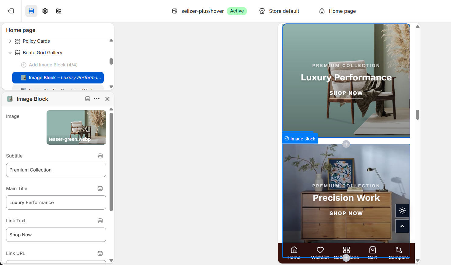
Bento Grid Gallery
Create visually stunning, asymmetrical image galleries that capture attention.
.png)
Overview
The Bento Grid is a premium design pattern that allows you to display four distinct content blocks in an asymmetrical layout. It is perfect for showcasing collections, brand values, or lifestyle photography.
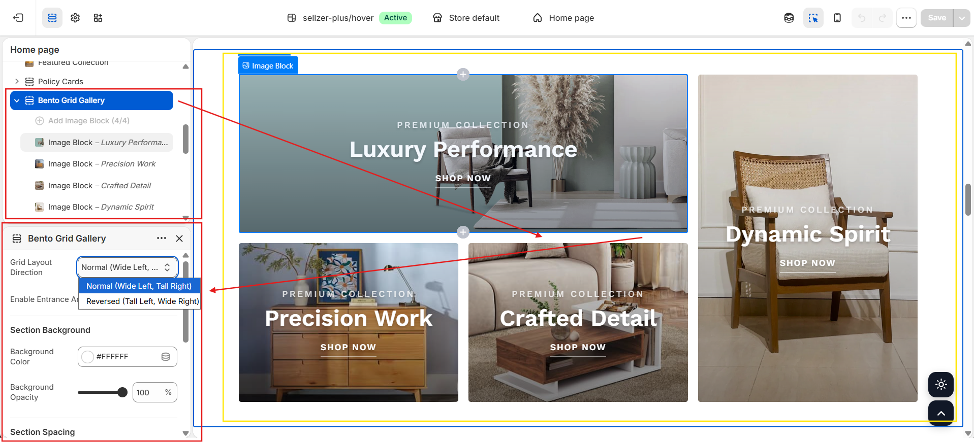
Grid Proportions
The section consists of 4 blocks with the following default logic:
Wide Left, Tall Right (LTR)
Blocks 1 & 2 are grouped, Block 4 spans the full height on the right.
Tall Left, Wide Right (RTL)
Block 4 spans the full height on the left, Blocks 1 & 2 are grouped on the right.
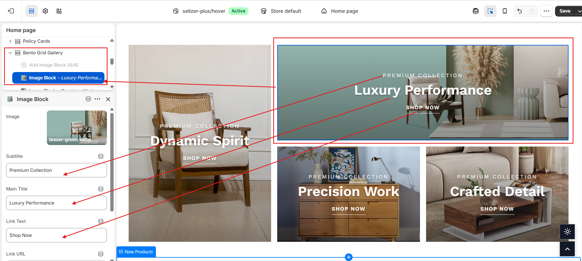
Block Customization
Each of the 4 blocks can be individually configured with:
- Image: High-resolution background image.
- Title & Subtitle: Large headings for brand messaging.
- Link Text: Underlined CTA link.
- Text Color: Overwrite the global text color to match the specific image background.
- Letter Spacing: Fine-tune the title typography.
Entrance Animations
The Bento Grid utilizes Sellzar's Reveal Engine to create smooth entrance effects as the user scrolls.
Instead of loading all animations at once, the theme uses the Intersection Observer APIto trigger animations only when a block enters the viewport (threshold 0.1). This ensures that heavy image grids don't impact initial page load speed.
Responsive Behavior
On mobile devices, the bento grid automatically collapses into a single-column vertical stack. The minimum height is adjusted to 300px per block to ensure images and text remain clear on smaller screens.