The Foundation
Footer System
Sellzar features a modular 3-level footer architecture, allowing for unprecedented flexibility in layout and content.
Footer System Layout Overview
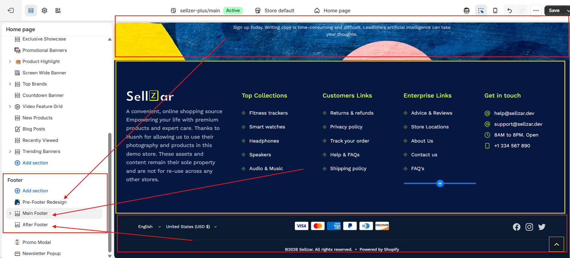
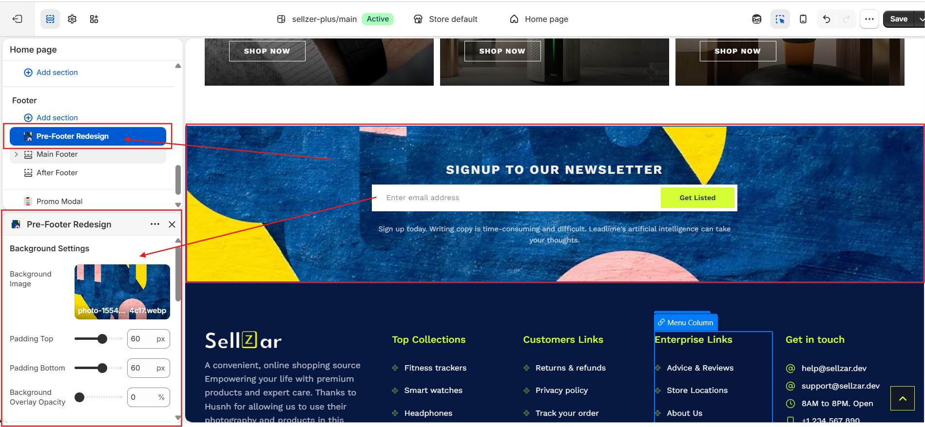
1. Pre-Footer
The pre-footer.liquid section is ideal for full-width trust builders, Instagram feeds, or large newsletter signups that sit just above the main footer columns.
Available Blocks:
- Newsletter Signup with custom heading
- Social Media icons with brand colors
- Trust Badges / USP cards
- Instagram Feed (App Block support)
Pre-Footer Section Preview
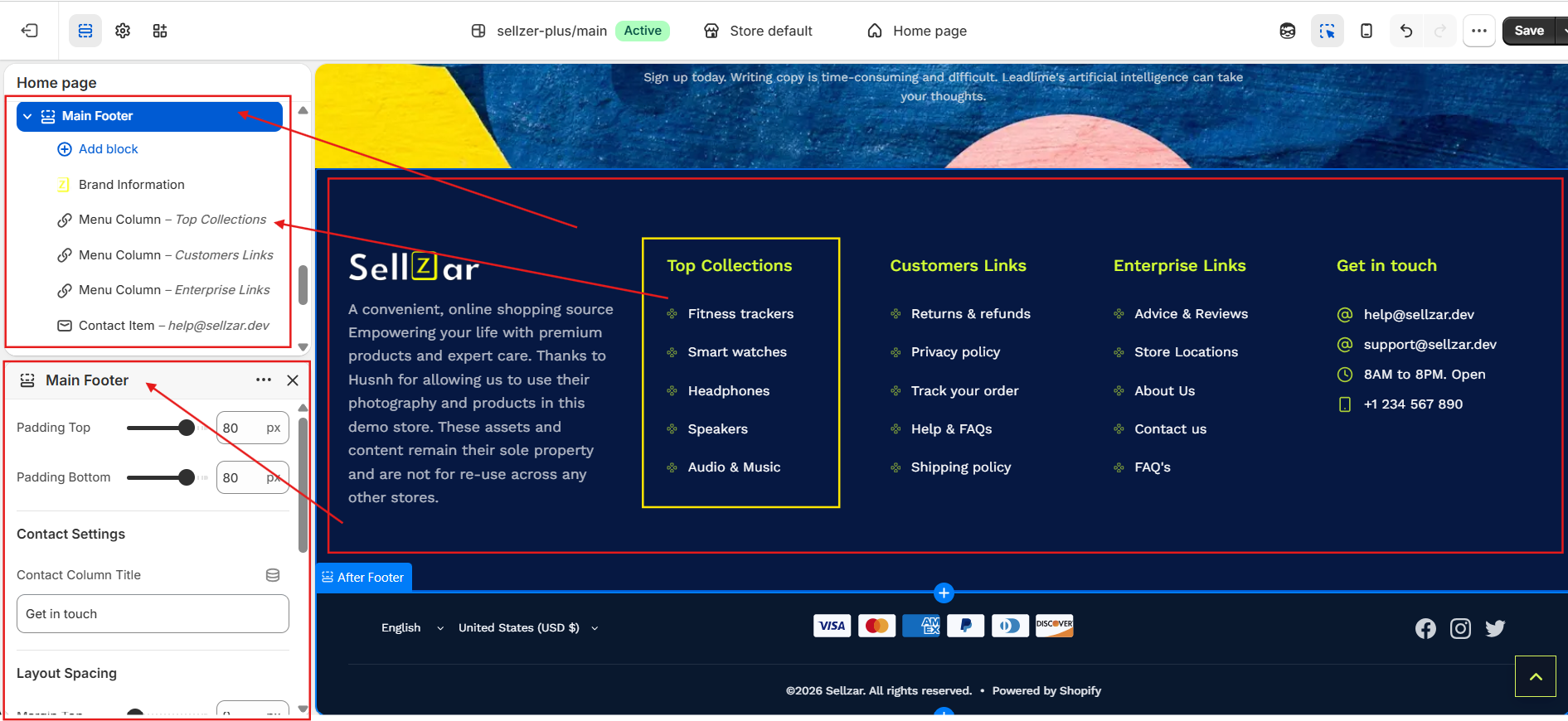
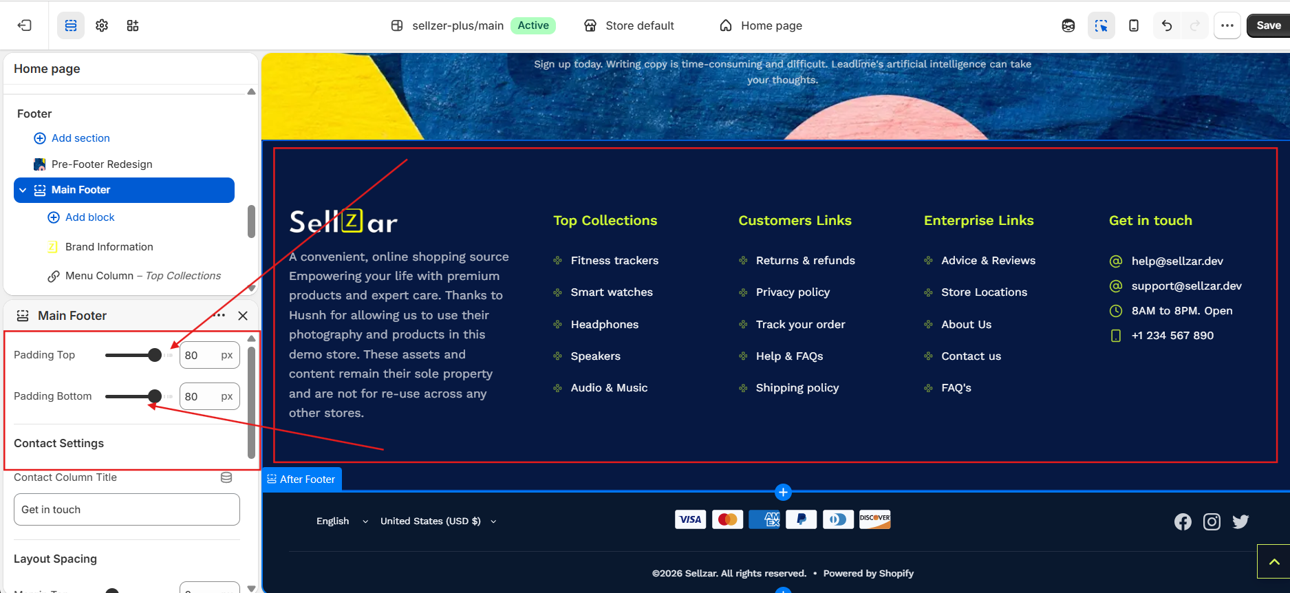
2. Main Footer
The core section where you define your brand info, navigation menus, and contact details.
Brand Info Block
Upload your logo and add a brief "About" description. You can also toggle the visibility of physical address and phone number.
Menu Columns
Add up to 4 menu columns. Use the "Lucide Icon" setting to add small decorative icons next to each link.
Main Footer Columns & Brand Block
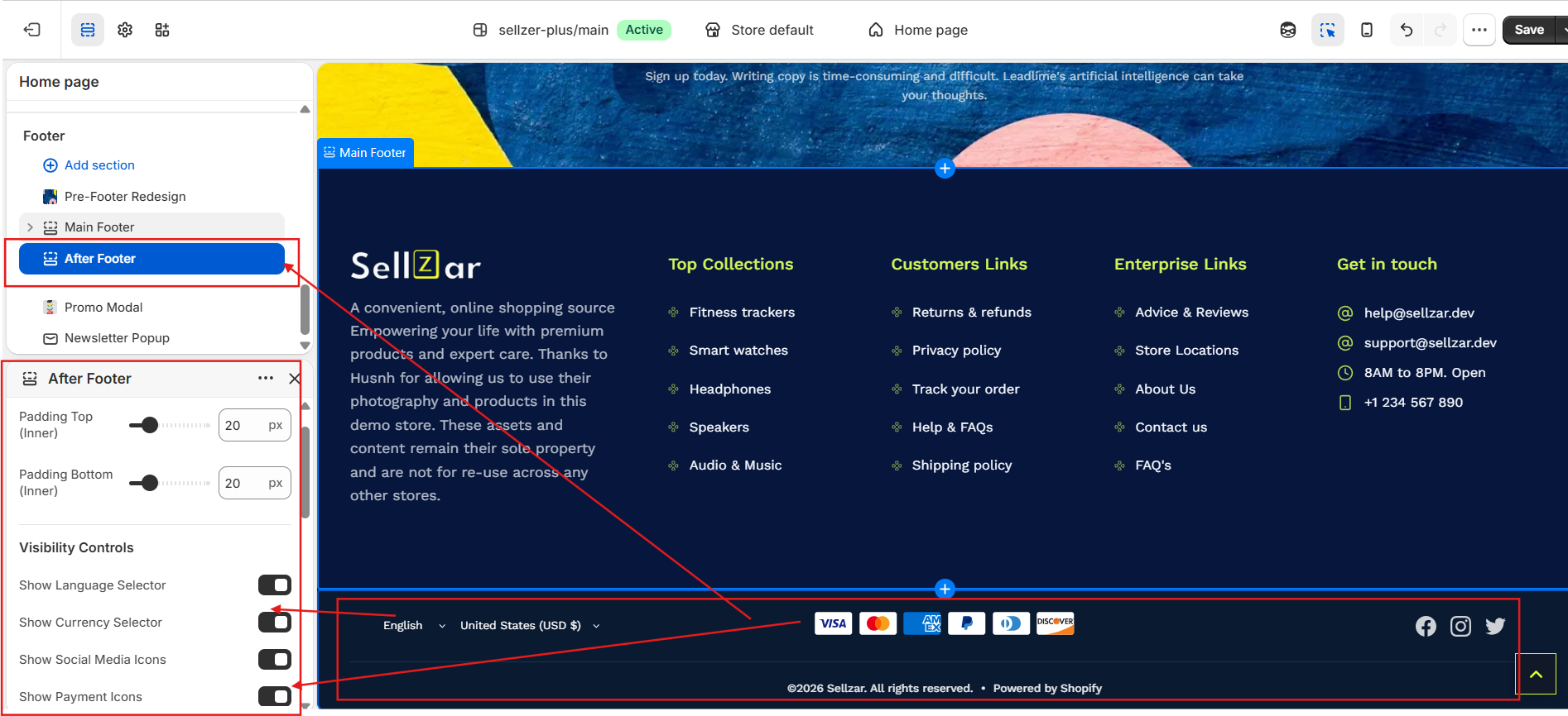
3. After-Footer
The after-footer.liquid section contains the copyright notice, policy links, and payment method icons.
Sellzar automatically detects your active Shopify payment methods and displays their official high-quality icons in the after-footer.
After-Footer & Payment Icons
Responsive Behavior
Mobile Accordion
Sellzar automatically converts footer columns into expandable accordions on mobile devices to save vertical space.
Section Overlap
Enable "Negative Margin" to allow the footer to sit behind the last page section for a modern look.
Footer Customizer Settings
Premium Footer Variant
For a more modern look, try the
premium-footer.liquidsection, which features a centered layout, larger social icons, and a simplified navigation structure.