Header Styles
Sellzar offers multiple header layouts to perfectly fit your brand's navigation needs.
.png)
.png)
Overview
The Header is the core of your store's navigation. Sellzar provides two primary layout architectures:Bar Layout (contained within a bar) and Flat Layout (full-width, seamless integration). Each can be customized with different logo alignments and utility bar configurations.
1. Logo Bar vs. Flat
Bar Layout
The logo and navigation are contained within a distinct background bar. Best for stores with a clear "utility" focus.
Flat Layout
The header content sits directly on the page background or overlay. Best for modern, minimalist designs.
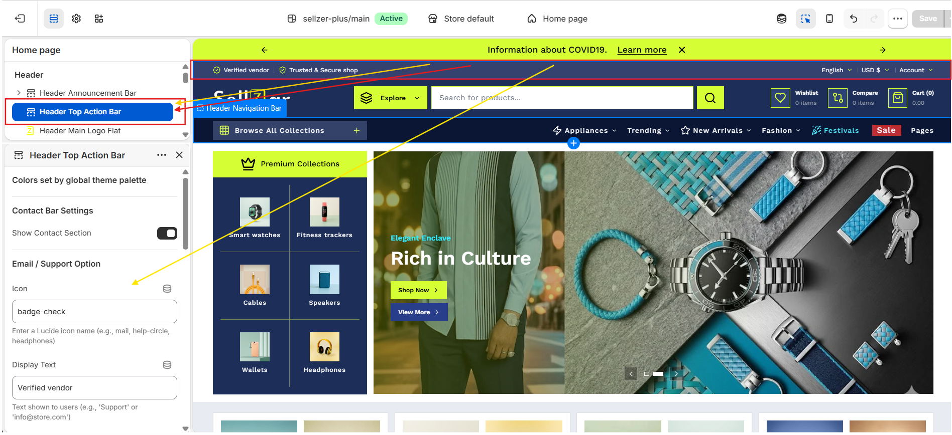
2. Top Action Bar
The top-most part of the header that handles utility functions and primary contact info.
- Social Integration: Displays icons linked in Theme Settings.
- Market Support: Automatic language and currency selectors.
- Customer Support: Quick-access phone and email links.
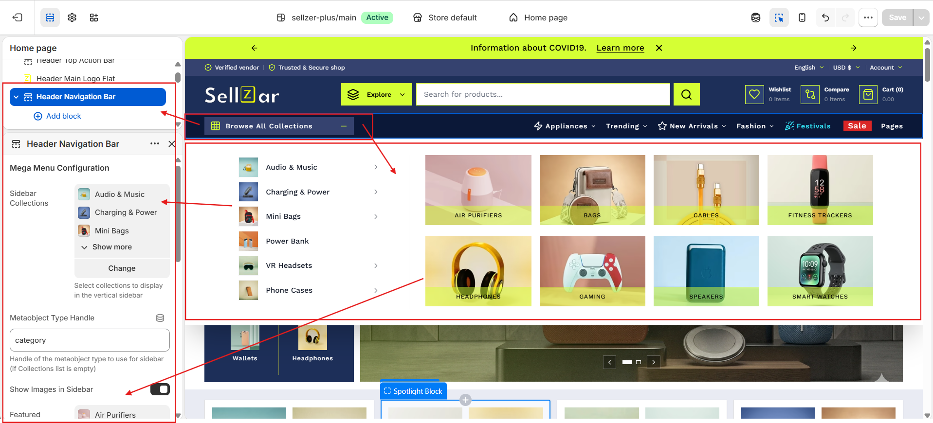
3. Mega Menus
Create advanced navigation by using blocks within the Header section.
To create a Mega Menu:
- Go to Header > Add Block.
- Select Mega Menu.
- Enter the Trigger Link Name (matches your Main Menu).
- Upload featured images or select featured collections to display.
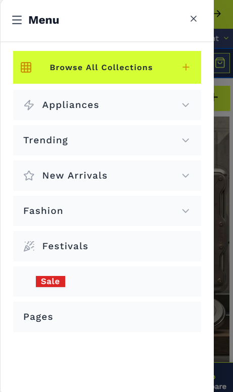
4. Mobile Navigation
Sellzar includes a custom mobile drawer designed for speed and ease of use on touch devices.
- Collapsible nested menus.
- Integrated search and account links.
- Theme-aware styling (Light/Dark).